Life is really complex. You have to balance various factors and take into account multiple priorities and responsibilities while trying to optimize your time and efforts in pursuit of a certain goal. May it be a short-term or long-term goal, you'll end up realizing that life is quite complex than you think it is.
Fractals are objects or phenomena that tend to look similar upon closer inspection by zooming in and out of the material. Fractality, in its essence, may also apply with life. You can observe that what you struggle with today for your day may also be your main struggle for your year, and so on. Looking at it in a more positive sense, your blessings and realizations of the day, can also be applied throughout the year, and even for the rest of your life. Even though this fractality may or may not add to the complexity of life, it is essential to know life's basics first before we go into deeper.
Some life basics are self-learnt, while some need proper supervision. One does not need to learn how to eat and ingest food but one needs proper guidance in excreting stool. Haha. It might be a weird example but yeah, you get my point. but there are just those basics which can never be fully understood. These basics are the life-blood of living and the variable that fits every equation in our universe. These are the ones that we allow to grow, nourish and embrace throughout the years.
Take love for example. You do not need "proper guidance" for you to love, because essentially, loving should be innate in us. But it is also an established fact that you need a certain amount of guidance in continuing that love for you to lessen the hurts and struggles that come with it. It's one basic in which you can never fully understand, and that's okay.
Like love, we have lab -- Scilab to be exact. I guess this is one thing that I'll know but I also won't fully understand; and yes, like love, that's okay as long as you're maturing and growing in love (in Scilab).
THE ACTIVITY
What is Scilab?
According to www.scilab.org, Scilab is a free and open source software for numerical computation providing a powerful computing environment for engineering and scientific applications. Well, if that sounds like a handful, Scilab is basically a free open-source tool used for video and image processing and analysis.
Also, from the handout given, it is said that Scilab is a free, high level, scientific programming language which is an acceptable substitute for Matlab. It has many features similar to Matlab foremost of which is its treatment of variables as arrays and matrices. Matrix math in Scilab
or Matlab is very convenient – matrix algebra can be performed in one line of code as compared to “for” loops in C or Fortran..
In this activity, we were tasked to explore and get comfortable with this software by obtaining various synthetic images and creating our own images through the concept of matrix multiplication and addition.
Initially, I downloaded the latest free version of Scilab, that's Scilab 5.5.2, and I then added the SIVP (Scilab Image and Video Processing) toolbox for ease of use. After that, I plotted the value given by the module and observed that the software works fine and is compatible with my laptop. I then proceeded with the practice before the activity (making a synthetic image of a centered circle) as shown in Fig. 1.
 |
| Figure 1. Initial steps in creating a centered circle through Scilab. This resulted in a low quality image, though the circle was executed properly. |
I then observed that the output image was somehow of low quality. I searched for image enhancements and higher quality images in Scilab and it led me to the imshow() command from the SIVP module. I also increased the size and the aperture ratio of the image. This resulted into a much higher quality image as seen in Fig. 2. I was quite happy with the output and I even customized and personalized my Scilab color scheme. I am now ready to do the activity!
 |
| Figure 2. A higher quality version of the centered circle image produced by Scilab |
The first task was to do a centered square aperture, which is given by Fig. 3, together with the code used. It was fairly easy because of the symmetry that the square has. I just introduced the abs () or the absolute value function to optimize the code and make use of the square's xy symmetry.
 |
| Figure 3. Centered square synthetic image |
The second task was to make a sinusoid along the x direction. I initially made a 2D sinusoidal image but I realized that it was just a plot and edited my code for it to be of a matrix type. I chose a sinusoid of frequency 10 and varied the code to the yt component as seen in Figure 4. I also realized that in Scilab, the axes are somehow tilted or rotated. A variation in the y axis corresponds to a variation in the x parameter in the code, and vice versa. The sinusoidal propagation along the x-axis can be further seen upon the introduction of the mesh() command for 3D images as seen in Figure 5.
 |
| Figure 4. A sinusoidal image propagating along the x direction |
 |
| Figure 5. A sinusoidal 3D image that propagates along the x direction |
The next task was to obtain a grating in the same orientation as the sinusoidal image. I thought that they were related and searched for a function that would either give 0 or 1 in Scilab. I then encountered the command round() that returned a rounded-off value. In this case, it's either I would offset my sinusoid or I would have to introduce the abs() function again to make it all positive. I chose the latter for simplicity and I could not think of a code that would offset the sinusoid martix. The results can be seen in Figures 6 and 7 wherein the 3D plot is introduced for better representation and comparison with the previous item.
 |
| Figure 6. A grating synthetic image along the x direction |
 |
| Figure 7. A 3D plot of a synthetic grating image along the x direction. |
After that, an Annulus or a ring was made by introducing two apertures and modifying the centered circle code to have ones values between those two apertures as seen in the code and image found in Fig. 8.
 |
| Figure 8. An annulus synthetic image made by the introduction of two apertures |
The next one was the hardest of the images to be obtained for it introduced a Gaussian transparency distribution. My initial action in seeing the problem was to search for the equation for the Gaussian distribution, given by:

Here, for simplicity, we chose mu = 0 and a quite high value sigma = 2 for a better representation of the Gaussian distribution transparency of the image. The equation was implemented in the code and a 3D plot using the mesh() command was used for better representation as seen in Figure 9.
 |
| Figure 9. A 2D and 3D plot of a circular aperture with a graded Gaussian transparency. |
I observed that the last two images (ellipse and cross) were just like variations of the first two images (circle and square). The parametric equation of the ellipse was just substituted in the R equation of the code for the circle, while for the cross, you can see it as either a superposition of two rectangles or 5 squares placed side-by-side with varying centers. For the Square, I chose the 1st method for the latter method used up more lines. These can be seen in Figures 10 and 11.
 |
| Figure 10. A 2D synthetic image of an ellipse. |
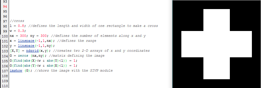 |
| Figure 11. A 2D synthetic image of a cross. |
Lastly, here comes the (more) fun part! Upon introducing, matrix multiplication and addition, you can come up with some quite cool images. Presenting:
 |
| THE EYE (Made by multiplying the annulus with the ellipse and then adding the Gaussian blur) |
 |
| LA CROSS (Made by multiplying the square with the cross and the gradient with the Gaussian blur, before adding the sinusoidal image) |
 |
| CHEVROLET ROULETTE (Made by adding the matrix products of the ellipse and the cross, the sinusoid and the square, and the gradient with the Gaussian blur) |
 |
| THE CASTLE (Can you guess why this is called, the castle?) |
See for yourself....
 |
| YES, THE CASTLE! |
I had fun during the activity, especially in editing the 3D mesh for the righ colors for better visualization. I would like to give myself a score of 12/10 because I did not only did what was asked but also incorporated SIVP imshow() and mesh() commands, together with the intricate editing of the 3D plots :) See you!


